
Apple Health UX Case Study
Improving navigation, personalization, and interface clarity to enhance user engagement and support meaningful health tracking.
2025 | UC San Diego Extension | UX Researcher | Usability Evaluation | Digital Health
Background
Apple Health brings together health data from the iPhone, Apple Watch, and connected third-party apps. While it offers rich insights, users often struggle to find what matters most, personalize their dashboards, and understand what actions were completed successfully.
As Apple continues expanding Health’s data sources and features, the app’s complexity has grown - sometimes at the expense of clarity and ease of use. This project set out to examine how real users interact with Apple Health and where its experience begins to falter.
Objective
This case study explored how simplifying navigation, improving personalization, and clarifying interface feedback could help users engage more meaningfully with their health data.
Through usability interviews and task-based walkthroughs with adults aged 47–64, the goal was to uncover friction points that impact confidence, understanding, and overall usability - especially for users managing multiple health goals or conditions.
User Research
User Personas
Four participants represented a range of comfort levels with technology and distinct health goals.


To uncover how design impacts understanding and engagement, interviews explored what helps or hinders users when accessing their health data. Participants were asked about their navigation habits, trust in the app’s feedback, and comfort with personalizing their health information.
Three recurring themes emerged from user responses:
Navigation Complexity - Users found it difficult to locate key data such as vitals or trends without excessive scrolling or trial and error.
Lack of Personalization - Dashboards felt generic, offering little control over which metrics appeared most prominently.
Unclear Feedback - Users were often unsure when actions (like adding data or syncing with Apple Watch) had succeeded.
Key Insight
Apple Health is a robust and data-rich platform, but its growing complexity leaves many users - especially middle-aged adults - feeling disoriented, unsupported, and uncertain.
They don’t just need data; they need clarity, confidence, and context - tools that help them make sense of what the numbers mean and how they relate to their goals.
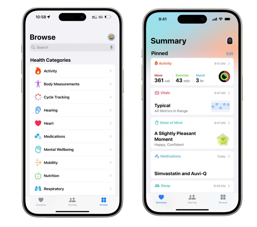
Problem 1
Complex Navigation
Users struggled to find specific health metrics and navigate between different sections of the app efficiently.
Problem 2
Lack of Personalization
The app's one-size-fits-all approach doesn't account for individual health goals and preferences.
Problem 3
Unclear Feedback
Unclear visual hierarchy and minimal system feedback created uncertainty during task completion.
Conclusion
Simplifying navigation, adding personalization, and clarifying feedback can transform Apple Health from a data repository into a tool that empowers and reassures users. Even small design adjustments - like clearer labels, confirmation states, and personalized dashboard layouts - can dramatically improve trust and ease of use.
What I Learned
This project reinforced the value of combining usability testing with contextual inquiry to uncover hidden friction points in everyday interactions. I learned to translate subtle user frustrations into clear, evidence-based usability problems and communicate findings in neutral, research-driven language.
It also deepened my understanding of how accessibility, clarity, and feedback directly shape user confidence - particularly in health-focused tools.
Next Steps
If continued, I would:
• Prototype adaptive dashboard layouts that respond to user-selected health goals.
• Conduct usability testing on proposed solutions to evaluate improvements in task success, efficiency, and satisfaction.
• Explore how multimodal feedback (visual, haptic, auditory) could enhance accessibility and reassurance.
Further research could also examine how personalization impacts older adults or users with chronic conditions to ensure inclusivity and long-term engagement.
Final Reflection
This project reaffirmed that designing for health means designing for clarity, empathy, and trust. When users feel guided and understood, data becomes more than information — it becomes insight that supports confidence, wellness, and connection.