Problem 3 - Unclear Feedback
Users shouldn't have to guess if something worked.
User Testing Insight
During 1-on-1 usability testing, all 4 participants expressed a desire for more control over what information appeared on their dashboard. Most were unaware that any customization was available.
“It took me forever to figure out I could even change what shows up in Summary.” - Tony
Problem
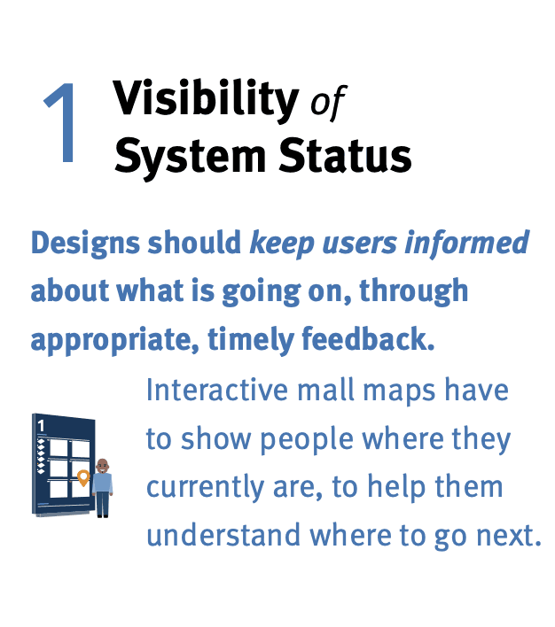
Apple Health's interface uses minimal visual hierarchy and includes vague labels like "Browse" and "Sources," which may create confusion for users. During usability testing, participants struggled to interpret certain interface elements and were unsure whether actions—such as adding goals—had been completed successfully.
Why It Matters
UX Heuristics
Simplify Task Flows.
Ensure key tasks can be completed in 2-3 steps.
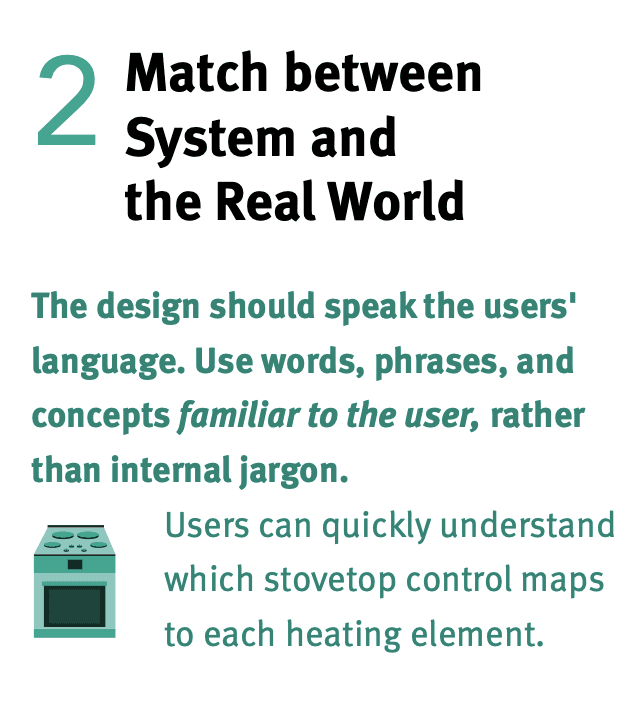
Clarify with Icons & Text Labels.
Use universally recognizable icons paired with brief, descriptive labels.
Apply Visual Consistency.
Standardize tile sizes, spacing, and information hierarchy for cleaner scanning.
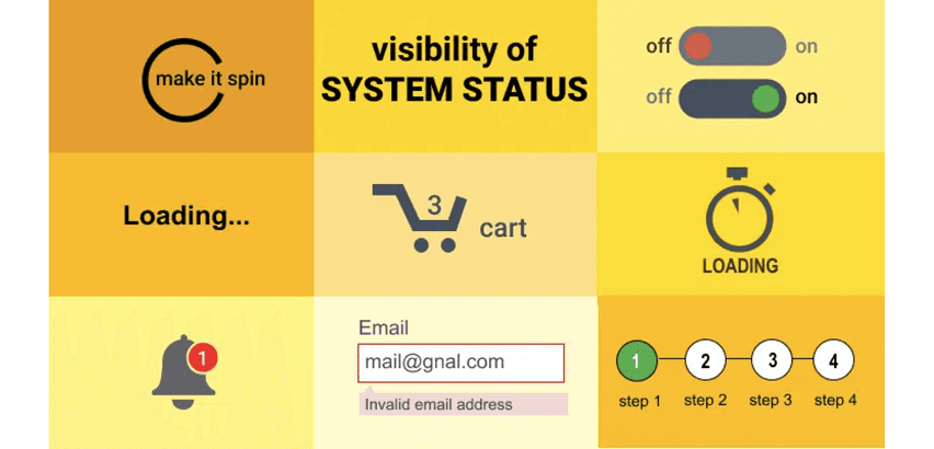
Provided Immediate Feedback.
Use subtle animations or confirmations ("You've added this goal!") to keep users informed.
Research Insight
"By communicating the current state of the system, users feel in control of the system, and this sense of control helps build trust."
Source: LinkedIn, "Visibility of System Status."