Problem 1 - Feature Fatigue
Too much information at once creates unnecessary cognitive effort.
User Testing Insight
During 1-on-1 usability testing with 4 participants, 3 experienced difficulty locating specific metrics - such as their most recent blood pressure reading. Several uses paused or scrolled through multiple sections, unsure where the information was located.
“There is just so much on screen - it's hard to tell what I should be looking at first.” - Linda
Problem
The Apple Health app presents users with an expensive amount of health data across multiple catergories, but lacks clear hierarchy and context. Users reported feeling overwhelmed by the volume of information and struggled to identify which metrics were most relevant to their health goals. The complexity of data presentation can lead to confusion and reduced engagement.
Why It Matters
UX Heuristics
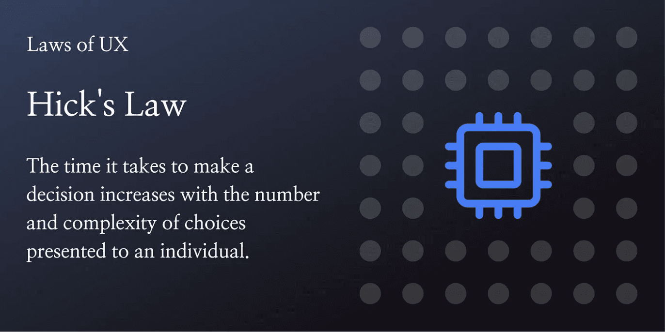
Laws of UX
Reduce cognitive load through progressive disclosure.
Group related data into collapsible sections to help users focus on top-priority insights first, with the option to explore additional details as needed.
Introduce drag-and-drop dashboard customization.
Allow users to rearrange, add, or remove health metric cards within an "Edit" mode, giving them more control over what information appears most prominently.
Prioritize frequently accessed metrics using usage patterns.
Use interaction data to surface health metrics that users view most often, improving relevance and potentially reducing time spent searching.
Showing only essential information at first helps reduce cognitive load and keeps the interface focused. Users can expand sections when they want more detail, allowing them to move at their own pace without feeling overwhelmed. UX Principle: Follows Hick’s Law — fewer visible options support faster, more confident decision-making.
Letting users rearrange or remove dashboard elements gives them a sense of control and ownership. This customization helps align the interface with personal health goals while reducing unnecessary clutter and creating a more intentional layout. UX Principle: Supports user autonomy and customization, which are linked to higher engagement and satisfaction.
Highlighting metrics based on user behavior makes the experience more efficient and personally relevant. By surfacing commonly viewed data, the app reduces navigation time and adapts to each user’s evolving needs. UX Principle: Uses smart defaults and contextual relevance to improve perceived usability and strengthen trust.
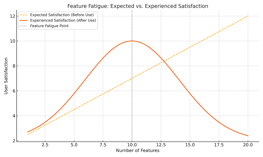
Research Insight
Research on feature fatigue suggests that as product complexity increases, perceived usability may decline - even if more capabilities are available. In Apple Health, the presence of many simultaneous visible metrics may reduce user satisfaction by increasing effort required to find relevant data.