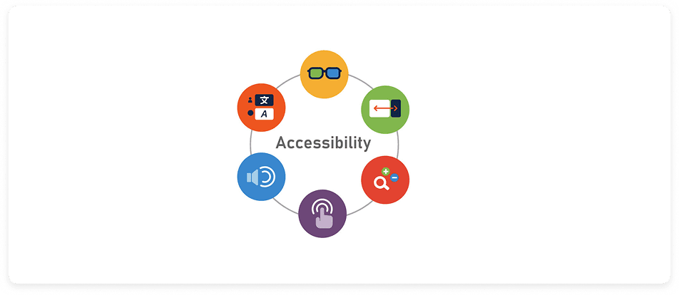
Problem 2 — Accessibility & Interface Clarity
Accessibility gaps quietly exclude the people who need support the most.
“My hands shake and I keep missing the button and text fields.” - Charles
Problem
Seniors using the platform face challenges with small touch targets, low contrast, cluttered layouts, and unclear visual hierarchy — barriers that reduce usability and confidence.
While this case study does not include a formal accessibility audit, all proposed solutions are designed to align with current accessibility guidelines.
Heuristics Violated
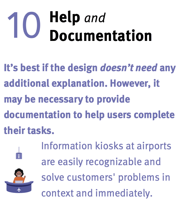
Solutions
Senior Mode + Global Accessibility Updates
Senior Mode & updates
Simplified layout
Larger tap targets
Adjustable text
Screen reader/labels
Desktop & speech input
Improved contrast
More accessibility
Why These Solutions Help
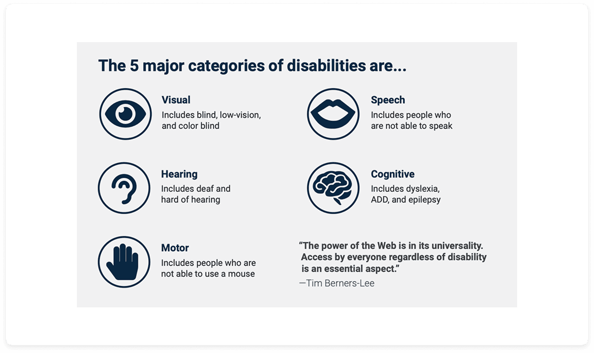
• Supports users with vision and dexterity limitations
• Reduces tapping errors, misinterpretations, and abandonment
• Ensures alignment with WCAG standards for inclusive design
• Encourages confident, independent use and increases task success
Research Insight
The Nielsen Norman Group and WCAG standards highlight that accessibility barriers—such as small touch targets, insufficient contrast, and non-resizable text—disproportionately affect older adults. According to research, even small updates that follow WCAG guidelines can significantly improve usability for aging and mobile-first populations.
Source: Kitaboo, 2025